Appearance
Template Styling & Connection
This guide will walk you through all the options in the Style and Connection tabs of the Review Template editor.
While the General Settings tab controls what content is shown (e.g., your platforms, filters, and header), the Style tab controls the visual design. This is where you can change all the colors, fonts, spacing, and borders to perfectly match your brand and website's look.
Style Settings
The Style tab is organized into several sections, each controlling a different part of your review feed.
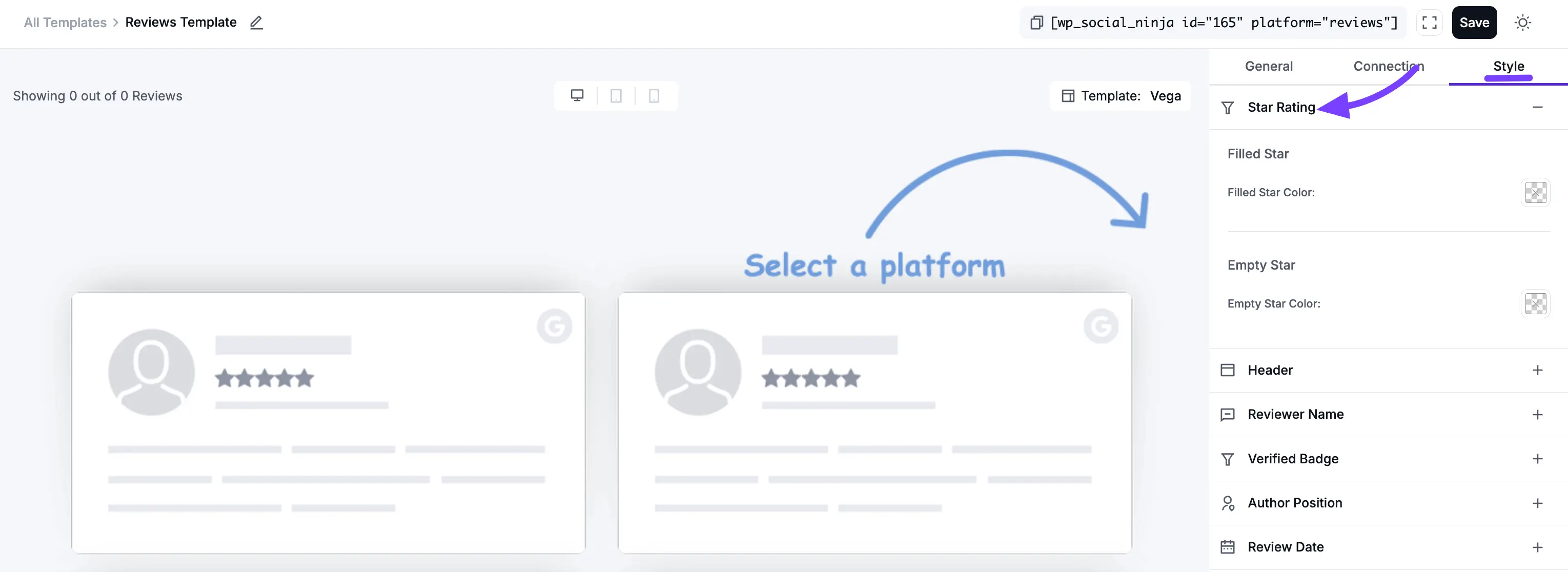
1. Star Rating
This section styles the (★) star ratings that appear on your reviews and in the header.
Filled Star
- Filled Star Color: This opens a color picker to set the color of the "filled" stars (e.g., the 4 gold stars in a 4-star review).
Empty Star
- Empty Star Color: This sets the color of the "empty" or "unfilled" stars (e.g., the 1 gray star in a 4-star review).
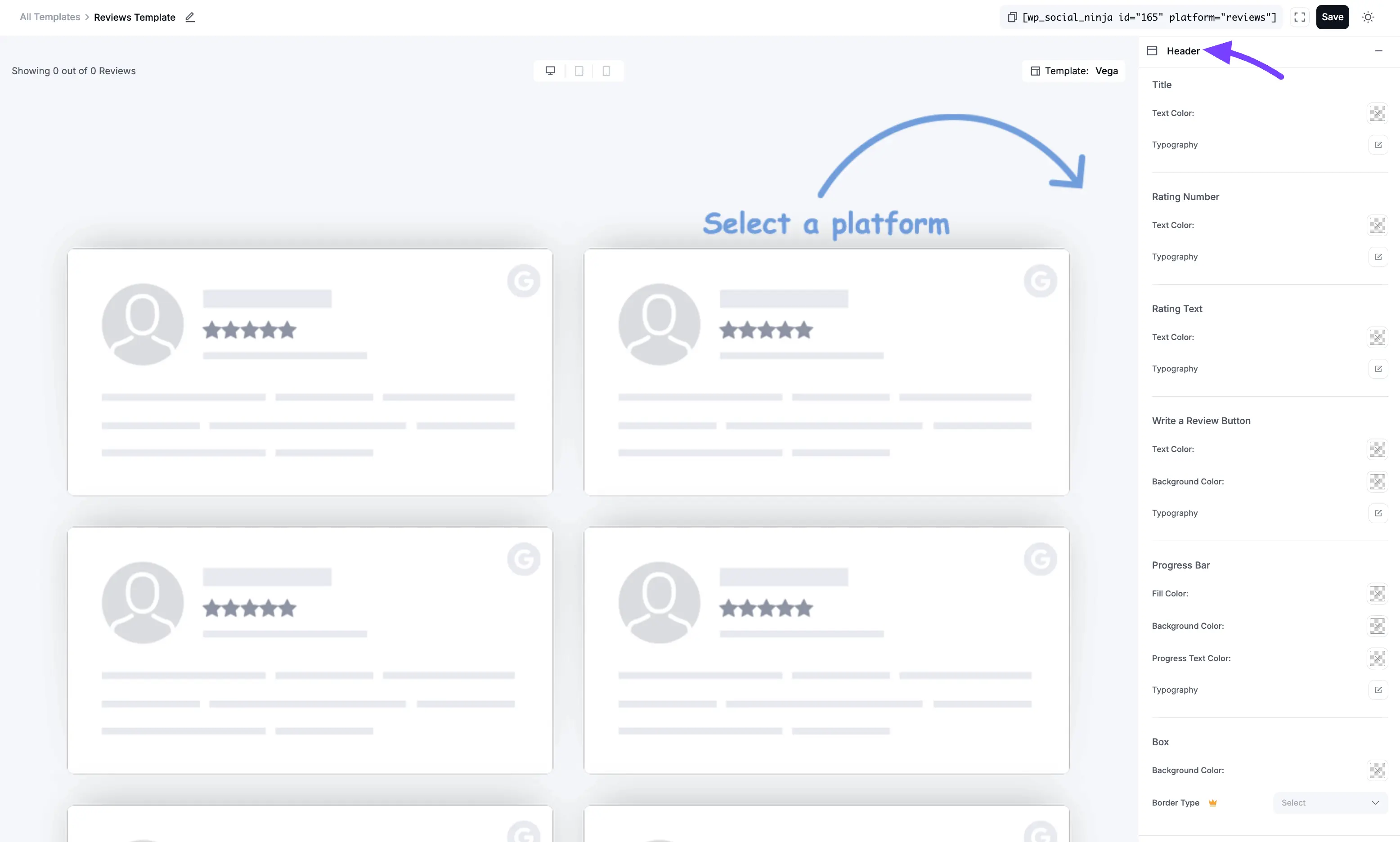
2. Header
This section controls the complete visual design of the Header at the top of your feed. This is the box that contains your overall rating summary, progress bars, and "Write a Review" button.
Title
This styles the main title of the header (e.g., "What Our Customers Say").
- Text Color: Sets the color of the title text.
- Typography: Opens a full set of font controls (Font Family, Size, Weight, etc.) for the title.
Rating Number
This styles the large average rating number (e.g., "4.9").
- Text Color: Sets the color of the number.
- Typography: Opens the font controls for the rating number.
Rating Text
This styles the text next to the number (e.g., "out of 5").
- Text Color: Sets the color of this text.
- Typography: Opens the font controls for this text.
Write a Review Button
This styles the "Write a Review" button (which you can enable in the General tab).
- Text Color: Sets the color of the text inside the button.
- Background Color: Sets the main background color of the button.
- Typography: Opens the font controls for the button's text.
Progress Bar
This styles the horizontal bars that show the breakdown of 5-star, 4-star, etc., reviews.
- Fill Color: Sets the color of the "filled" part of the bar (the part showing the percentage).
- Background Color: Sets the color of the "empty" part of the bar.
- Progress Text Color: Sets the color of the text label for the bar (e.g., "5 Star").
- Typography: Opens the font controls for the progress bar text.
Box
This controls the overall container or "box" that holds all the header elements.
- Background Color: Sets a background color for the entire header area.
- Border Type: Lets you choose the style of the border for the header box (e.g., Solid, Dotted, Dashed, or None).
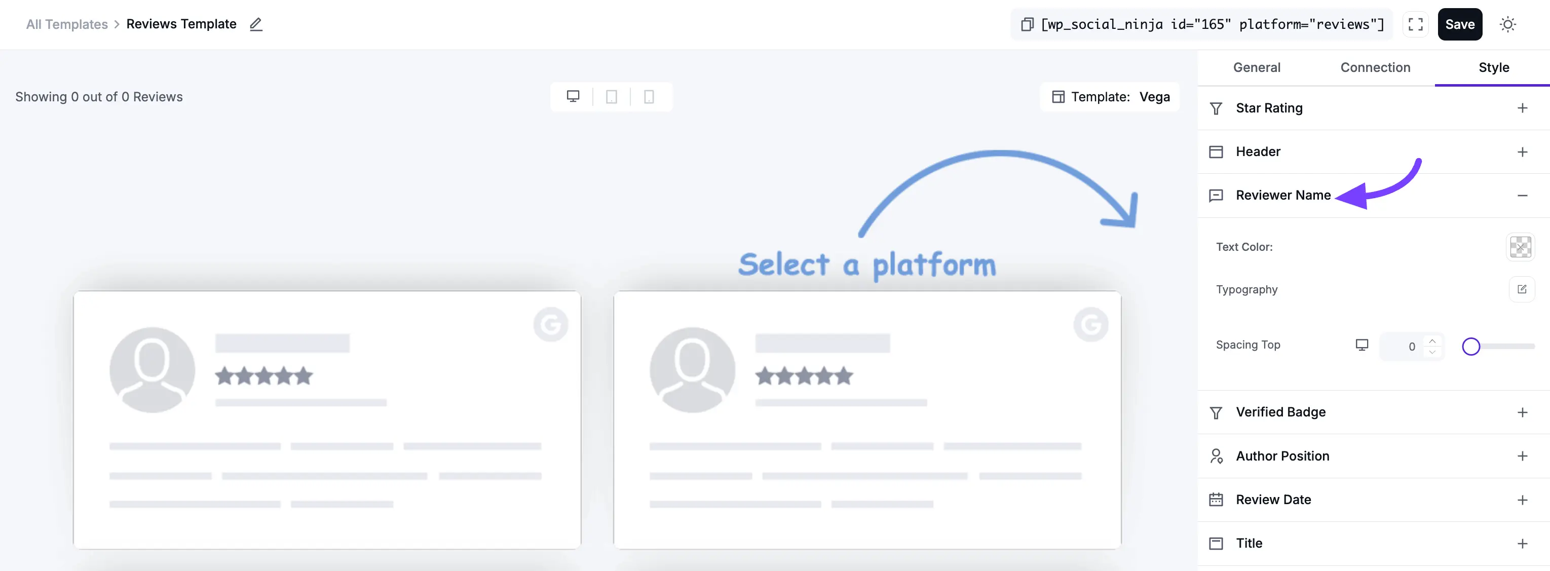
3. Reviewer Name
This section styles the author's name on each individual review card.
- Text Color: Sets the color of the reviewer's name.
- Typography: Opens the full set of font controls for the name.
- Spacing Top: This adds a bit of empty space (in pixels) above the name, pushing it away from the element above it (like the star rating).
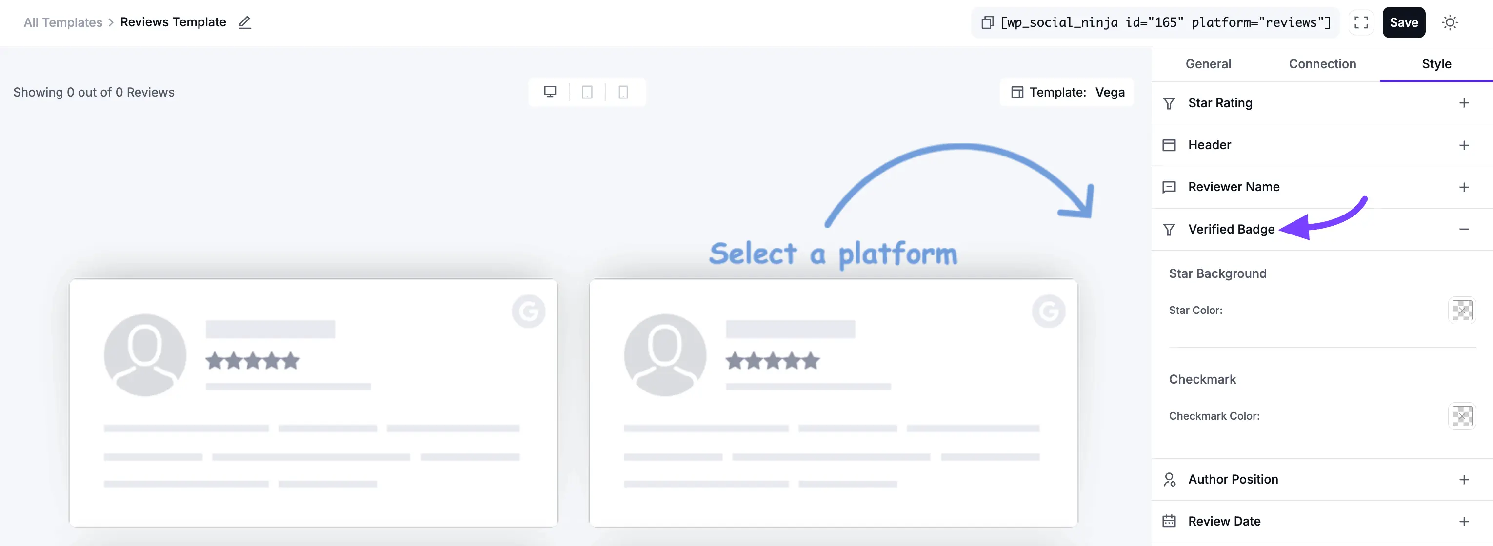
4. Verified Badge
This section styles the "Verified" badge that can appear on reviews.
Star Background
- Star Color: Sets the color of the star icon inside the badge.
Checkmark
- Checkmark Color: Sets the color of the checkmark icon inside the badge.
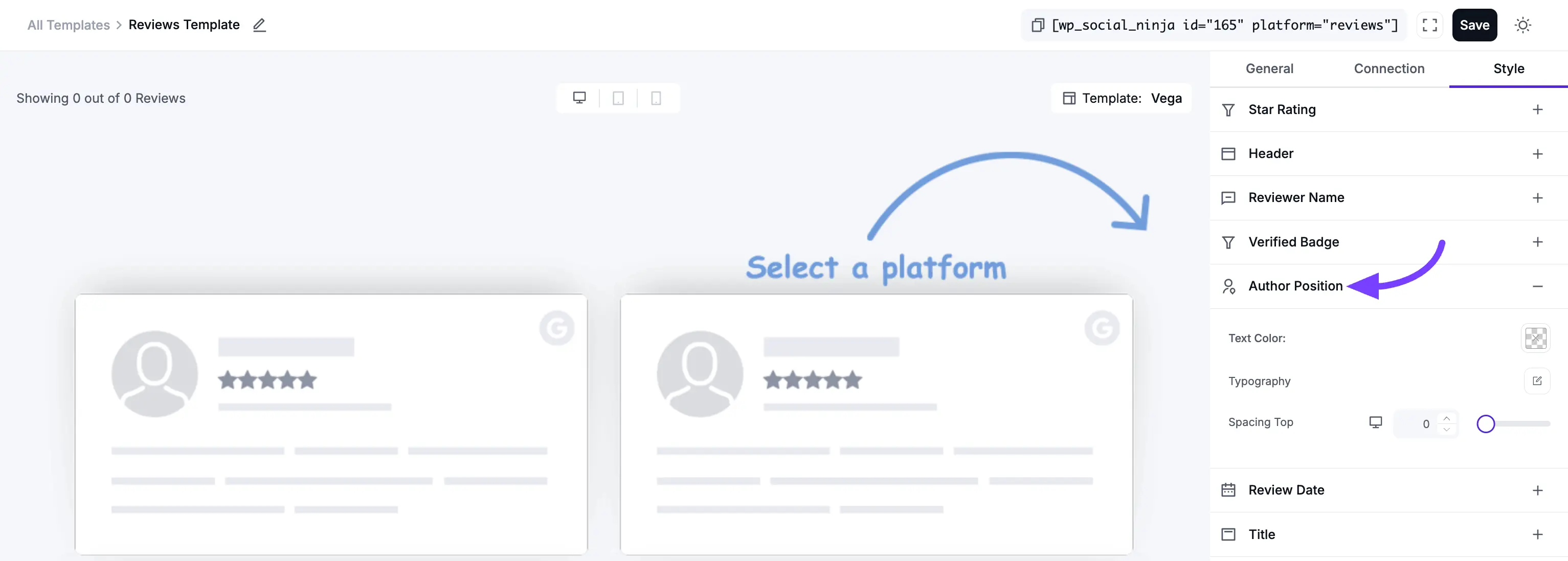
5. Author Position
This section styles the author's job title (e.g., "Marketing Manager"), which you can add to Testimonials.
- Text Color: Sets the color of the author's position text.
- Typography: Opens the full set of font controls for this text.
- Spacing Top: This adds empty space (in pixels) above the author's position.
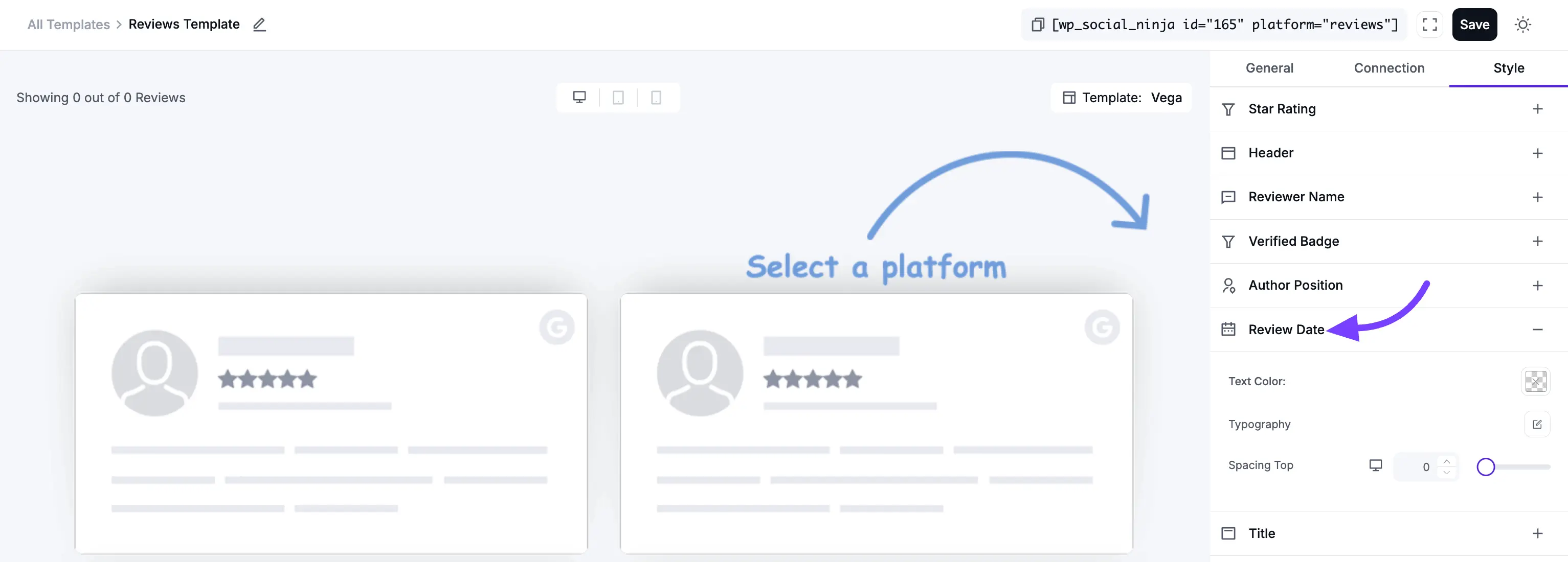
6. Review Date
This section styles the date (e.g., "October 30, 2025") on each individual review card.
- Text Color: Sets the color of the date text.
- Typography: Opens the full set of font controls for the date.
- Spacing Top: This adds empty space (in pixels) above the date.
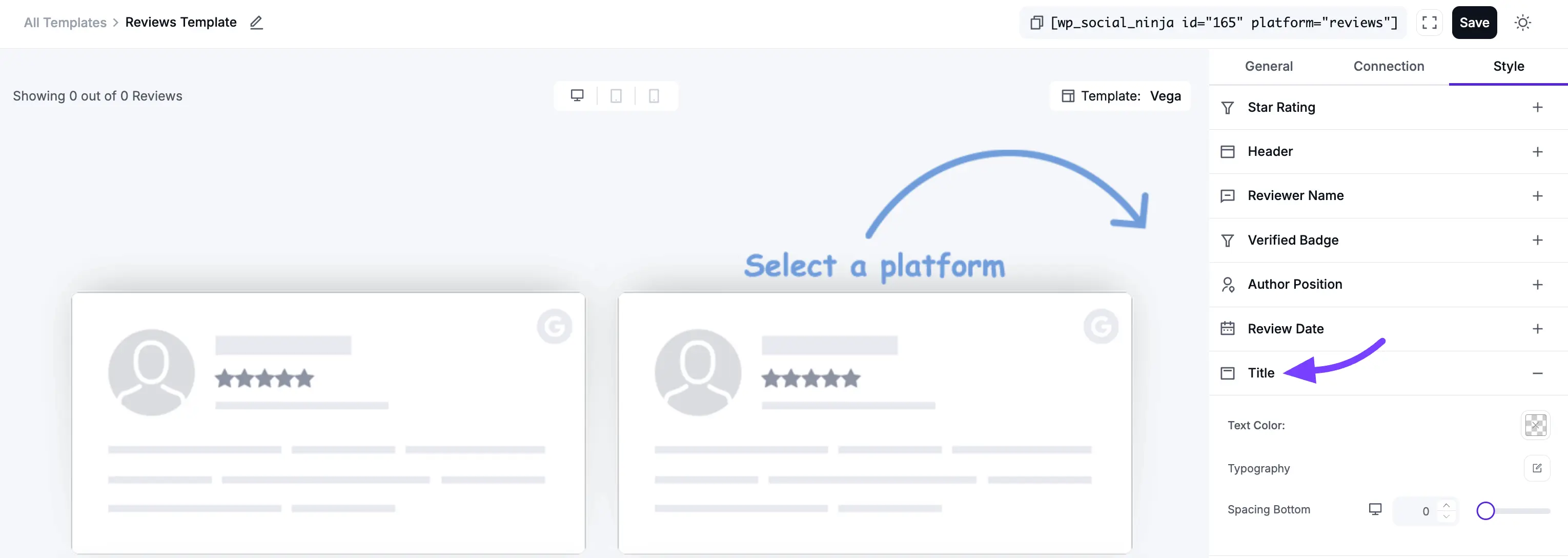
7. Title
This section styles the main "headline" or "title" of each individual review (e.g., "The Best Plugin Ever!").
- Text Color: Sets the color of the review title text.
- Typography: Opens the full set of font controls for the review title.
- Spacing Bottom: This adds empty space (in pixels) below the title, pushing it away from the main review text.
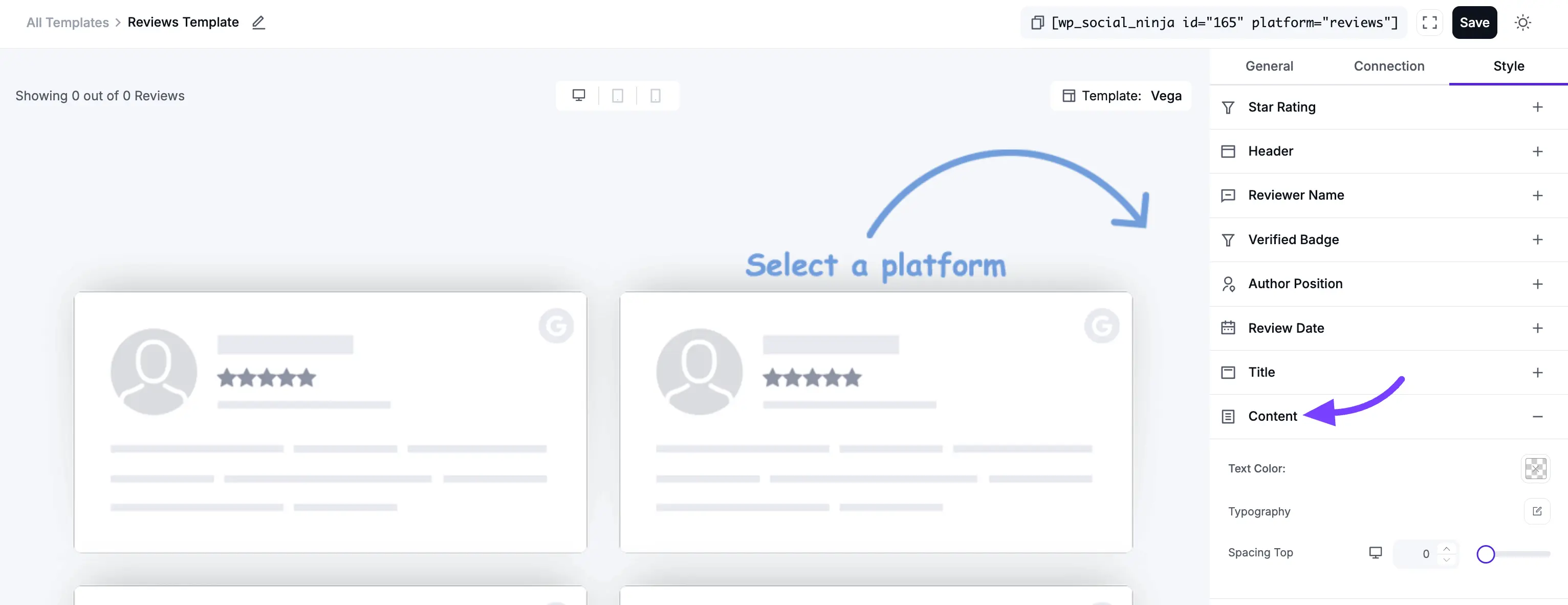
8. Content
This section styles the main body text (the full review) on each individual review card.
- Text Color: Sets the color of the main review text.
- Typography: Opens the full set of font controls for the review text.
- Spacing Top: This adds empty space (in pixels) above the review text.
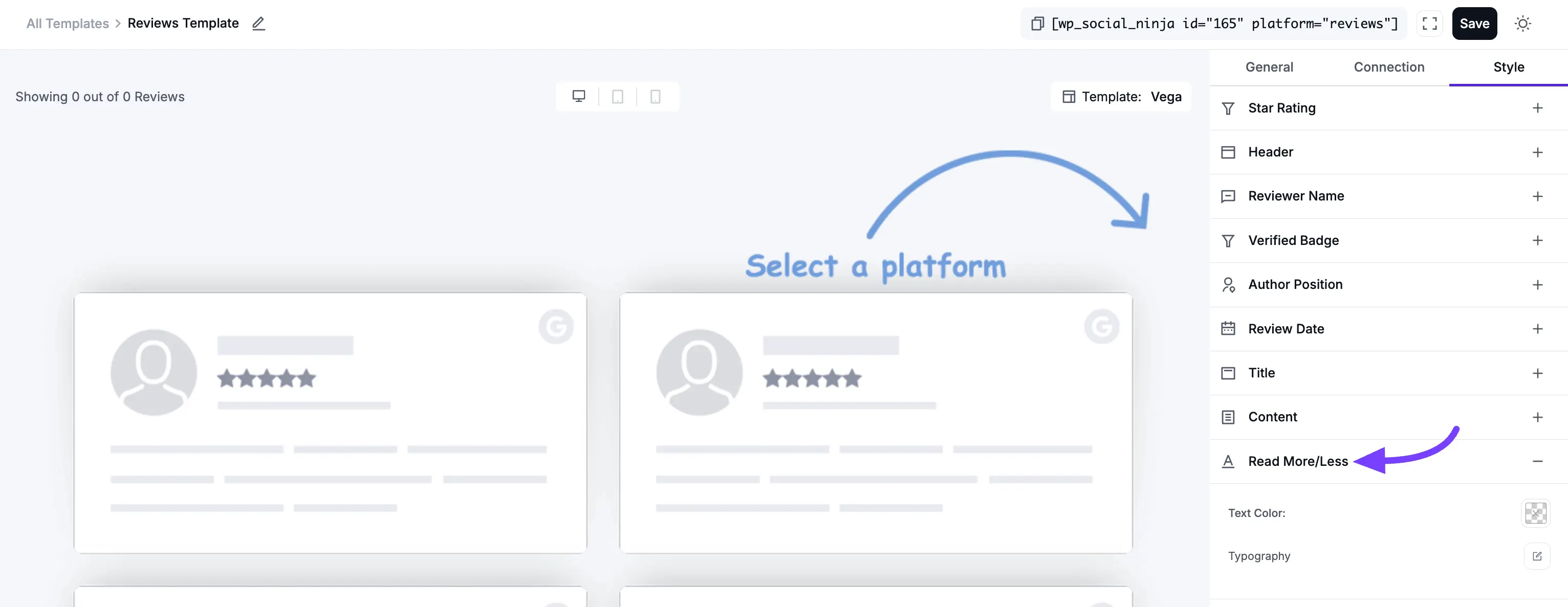
9. Read More/Less
This section styles the "Read More" or "Read Less" link that appears on long reviews.
- Text Color: Sets the color of the "Read More/Less" link, making it stand out.
- Typography: Opens the full set of font controls for this link.
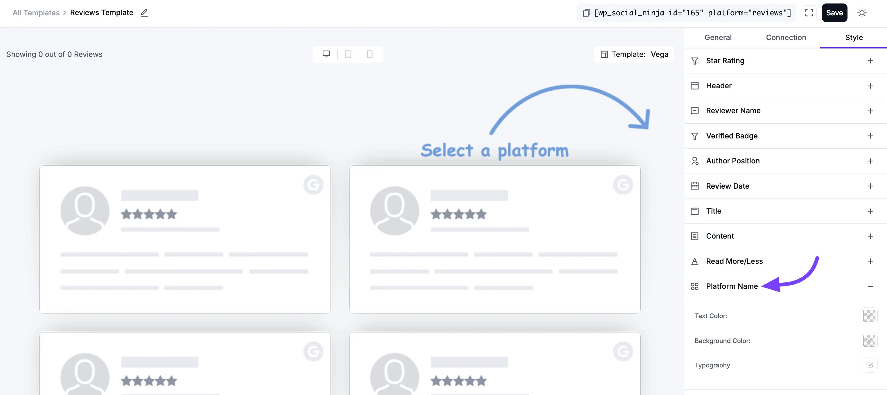
10. Platform Name
This section styles the platform label (e.g., "Google," "Facebook") that can appear on each review card.
- Text Color: Sets the color of the text inside the platform badge.
- Background Color: Sets the background color of the platform badge itself.
- Typography: Opens the full set of font controls for the platform name.
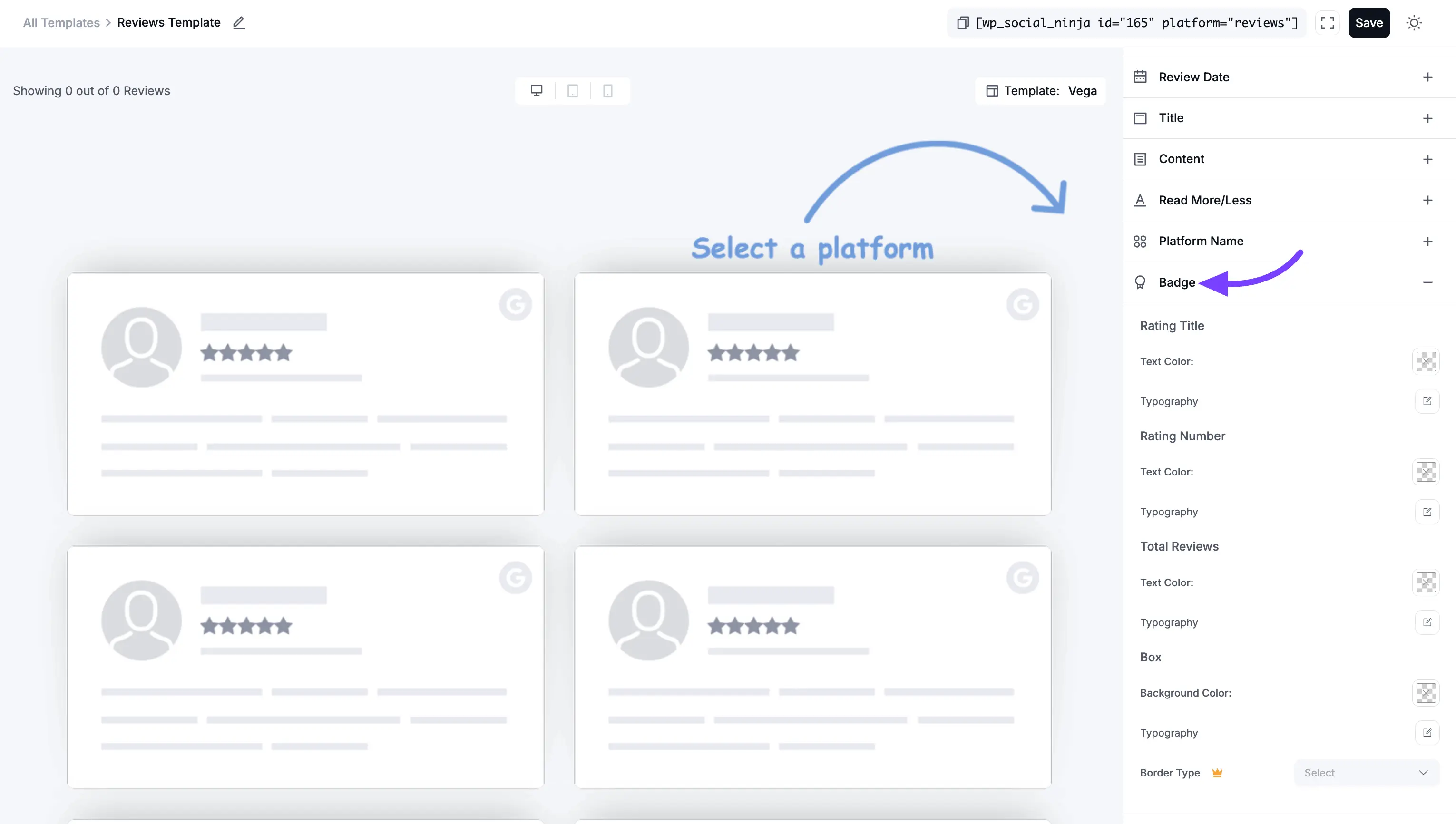
11. Badge
This section styles your template only if you selected the "Badge" layout type in the General tab.
Rating Title
- Text Color: Sets the color of the text (e.g., "Rated").
- Typography: Opens font controls for this text.
Rating Number
- Text Color: Sets the color of the average rating (e.g., "4.9").
- Typography: Opens font controls for this number.
Total Reviews
- Text Color: Sets the color of the total reviews text (e.g., "Based on 150 reviews").
- Typography: Opens font controls for this text.
Box
- Background Color: Sets the background color of the entire badge.
- Typography: (This likely refers to a global font setting for the badge if other typography is not set).
- Border Type: Lets you choose the style of the border for the badge (e.g., Solid, Dotted, Dashed, or None).
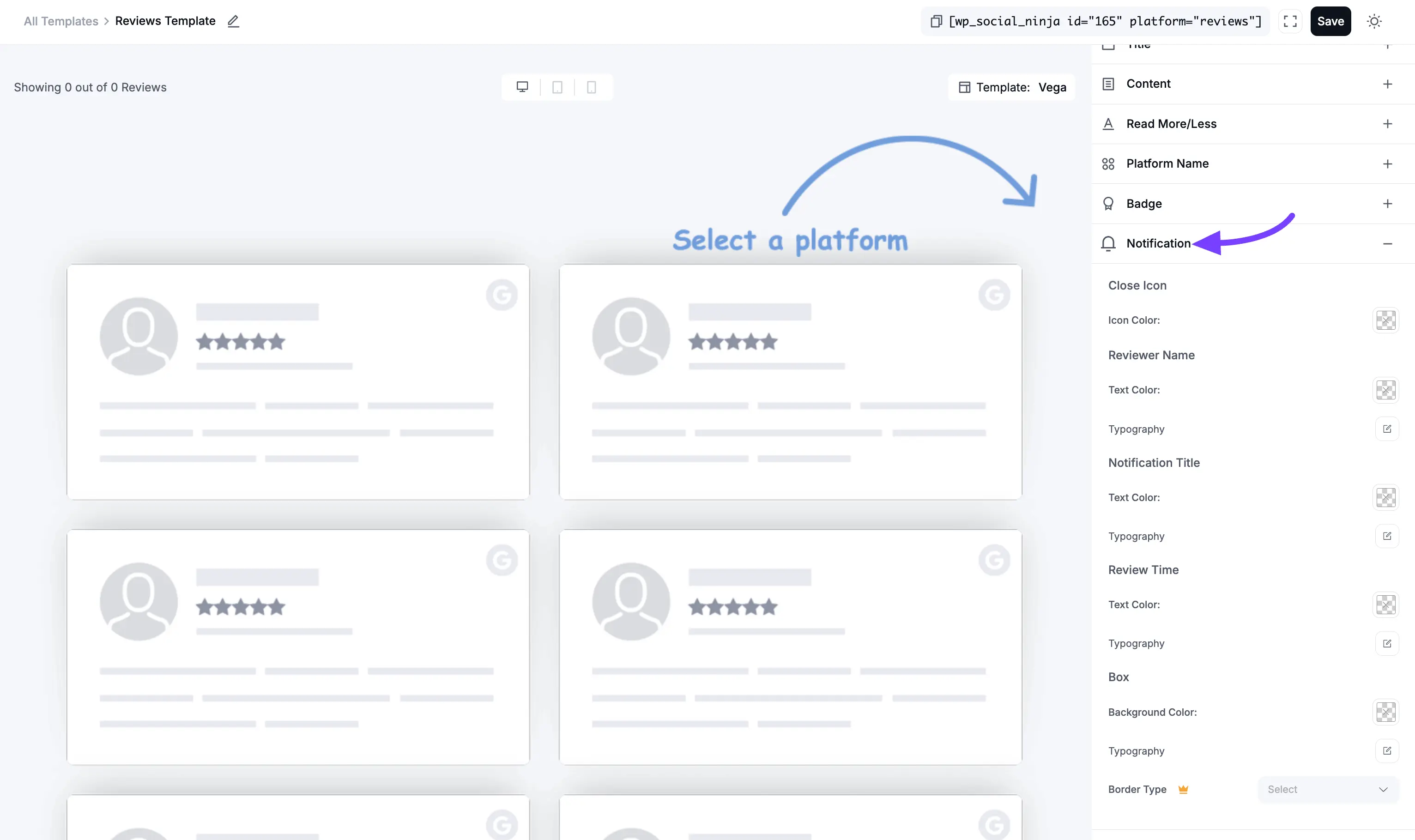
12. Notification
This section styles your reviews only if you are using them in a Notification Popup.
Close Icon
- Icon Color: Sets the color of the "X" (close) icon on the notification.
Reviewer Name
- Text Color: Sets the color of the reviewer's name.
- Typography: Opens font controls for the name.
Notification Title
- Text Color: Sets the color of the title text (e.g., "New 5-star review!").
- Typography: Opens font controls for the title.
Review Time
- Text Color: Sets the color of the timestamp (e.g., "2 hours ago").
- Typography: Opens font controls for the time.
Box
- Background Color: Sets the background color of the entire notification popup.
- Typography: (This likely refers to a global font setting for the popup).
- Border Type: Lets you choose the style of the border for the popup.
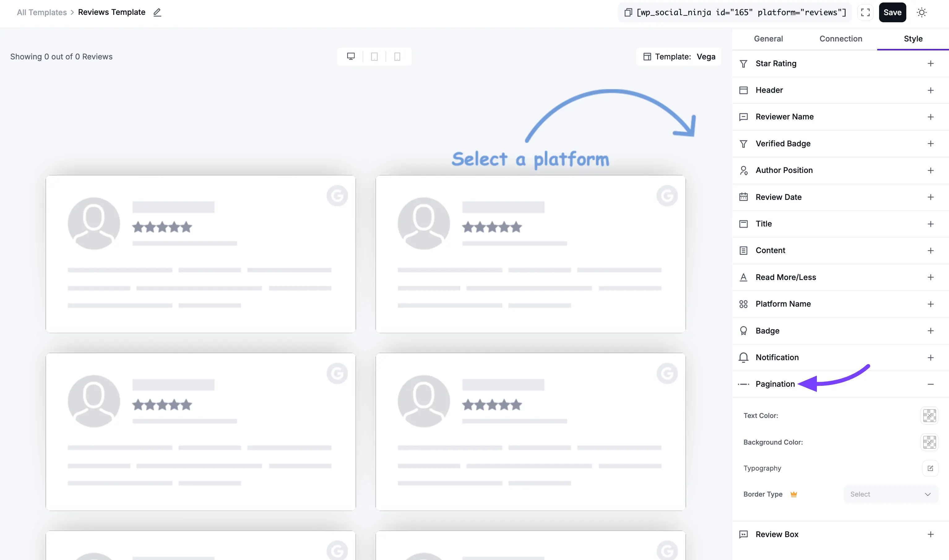
13. Pagination
This section styles the "Load More" button at the bottom of your feed (if you enabled it in the General tab).
- Text Color: Sets the color of the text inside the "Load More" button.
- Background Color: Sets the main background color of the button.
- Typography: Opens the full set of font controls for the button's text.
- Border Type: Lets you choose the style of the border for the button (e.g., Solid, Dotted, Dashed, or None).
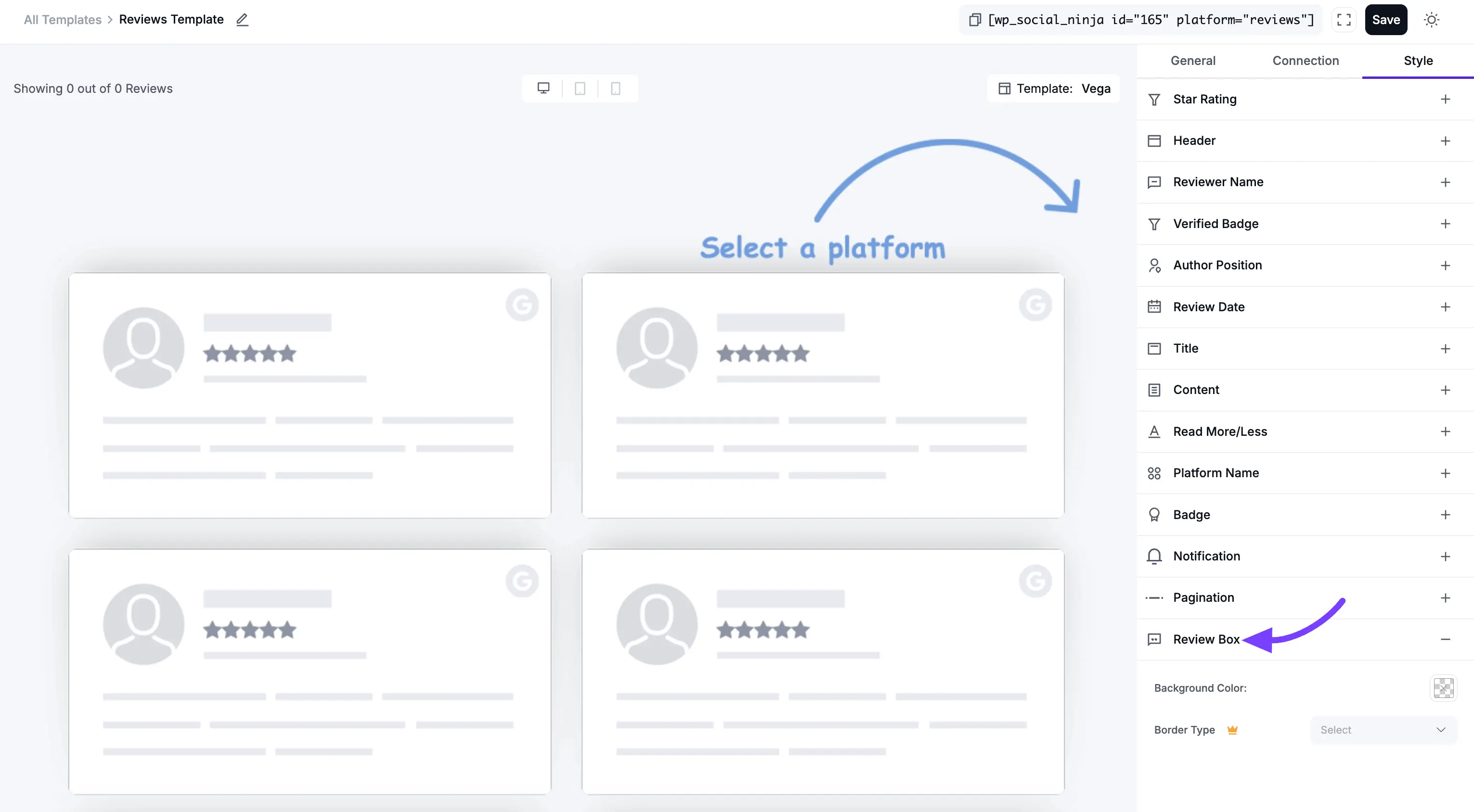
14. Review Box
This is a very important section. The Review Box is the entire container or "card" that holds each individual review. These settings control the design of that main box.
- Background Color: This sets the background color for the entire review card. By default, it's usually white or transparent.
- Padding: This is the "breathing room" inside the review card. It's the empty space between the card's border and the content inside it (like the star rating and review text). You can set the padding (in pixels) for the Top, Right, Bottom, and Left sides individually.
- Border Type: This lets you choose the style of the border for the review card (e.g., Solid, Dotted, Dashed, or None).
- Width: This setting (which appears if you select a Border Type) lets you control the thickness of the border. You can set the thickness (in pixels) for the Top, Right, Bottom, and Left sides individually.
- Color: This opens a color picker to set the color of the border itself.
Connection Settings
The Connection tab is a simple shortcut. It allows you to connect a new review platform (like Facebook, Google, Yelp, Trustpilot, etc.) right from within the template editor.
This is very useful if you are building a template and realize you want to include a platform you haven't connected yet, or if you want to add multiple accounts from the same platform.
Please Note: The steps to connect an account here are identical to the main platform connection process.
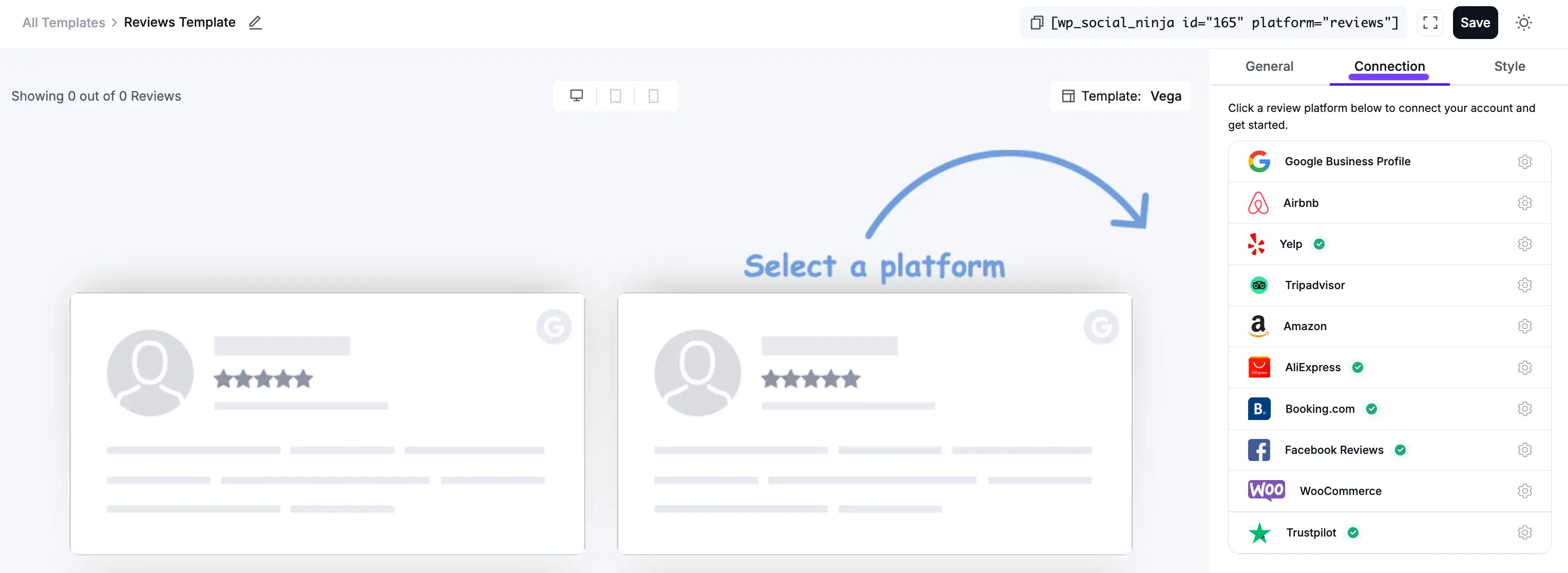
For a complete, step-by-step guide on how to connect each platform, please see our main Configuration guides:
- How to Connect Google Reviews
- How to Connect Facebook Reviews
- How to Connect Yelp Reviews
- How to Connect Trustpilot Reviews
- (and so on for all other platforms)